

Circuit is a pretty interesting company to design a brand for. They operate in cities all over the country, but the actual experience of using Circuit is incredibly local. People use it to get groceries, go to doctor’s appointments, get to work, go out to dinner, or just get around their neighborhood. The service might work a little differently depending on where you are, but underneath it all, it’s still Circuit.
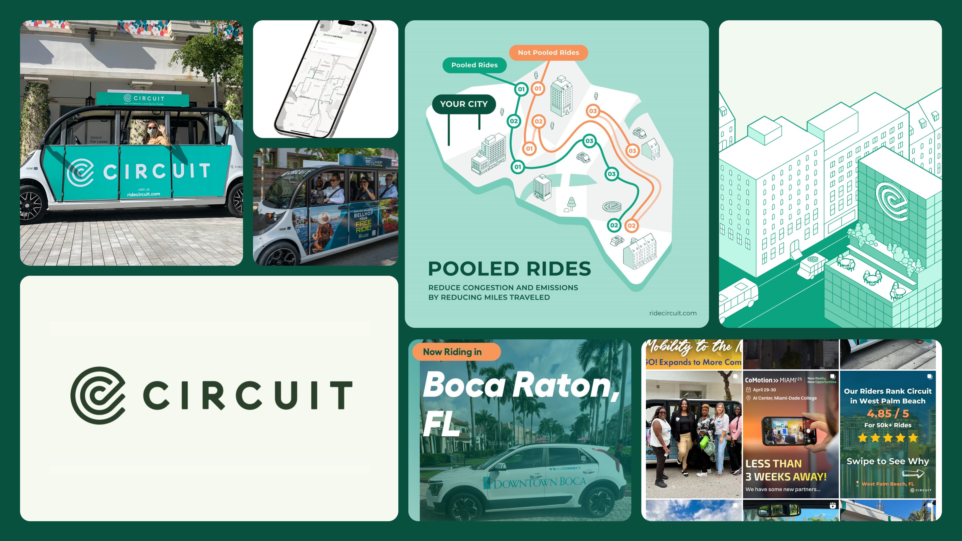
When we first started the project, we made what I think is a pretty natural assumption: the audience for Circuit is the people riding Circuit. They’re the ones seeing the cars, downloading the app, interacting with the drivers, and actually using the thing every day. Of course that’s who we should be designing for.
Except, once we got into the strategy work, we realized that wasn’t actually the audience that mattered most (more on this shortly).
That ended up being a pretty important shift in how we thought about the project and, ultimately, how we approached the identity itself. We also had this other interesting challenge of figuring out how to build a national brand that could feel consistent and recognizable everywhere, while still feeling authentically local to the city you’re actually in.
With all these challenges in mind, it was exactly the kind of project we like working on. If you’re not familiar, Circuit offers low-cost or free last-mile transportation, uses electric vehicles, and is generally doing something we think is good for the communities it serves. And from a design standpoint, there was a ton for us to play with: the identity, website, motion, out-of-home, apparel, and, of course, the actual cars driving around the city.
Designing for the City
In some of our initial calls, the Circuit team talked about how much their riders depend on them for local transportation. People use Circuit for everything from grocery runs and picking up medicine to doctor’s appointments, work, or just going out to dinner. There was a sincere connection between the service and the communities using it regularly. And the same basic story was true in completely different places, be it the Hamptons, Miami, Philadelphia, or wherever. There was this sense of local pride around using your local Circuit to get around.
But as we got deeper into the strategy, we realized the riders were only one side of the equation. The people actually deciding whether Circuit comes to a city in the first place are local government officials, transportation departments, budgetary committees, and the other people involved in deciding where a city spends its money.
So we needed to design for the decision makers, not just the riders.
One of the ideas we landed on was that cities want proof of progress. They want to show that they’re developing, that they’re well connected, that they’re investing in infrastructure, and, most importantly, that they’re actually serving the people who live there. That led us to one of the main strategic ideas for the project: make every ride feel like a win for the city.
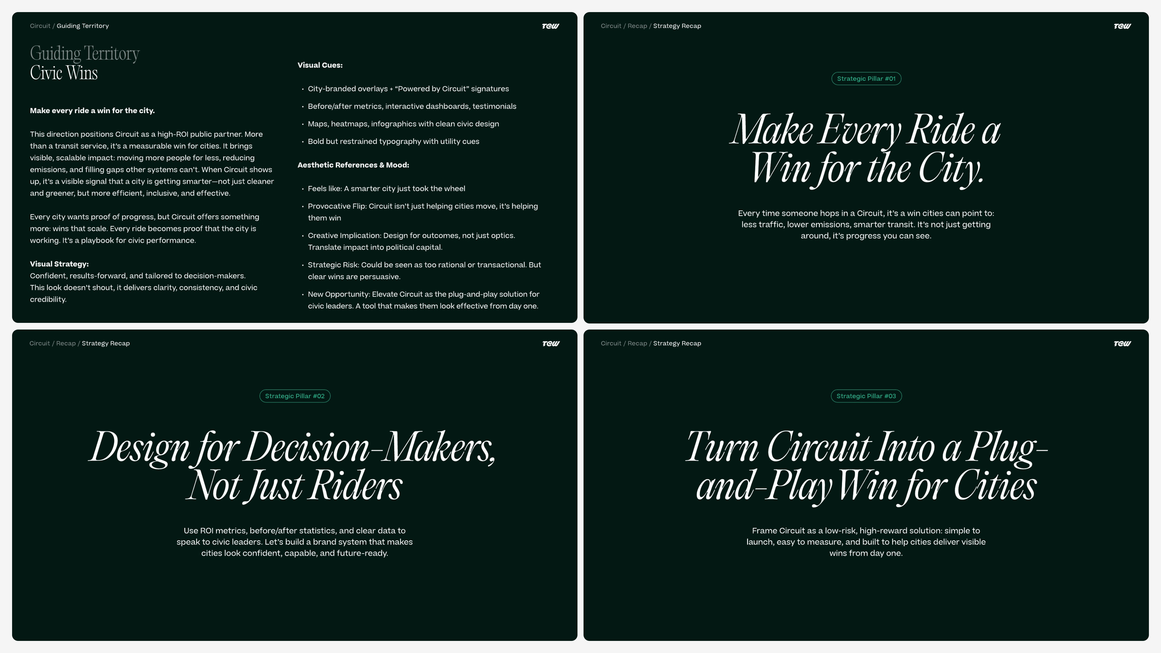
A Circuit car moving down the street isn’t just someone getting from point A to point B. It’s a visible sign that the city is investing in its people and its infrastructure. When Circuit shows up, it’s a sign that a city is getting smarter, not just cleaner and greener, but more efficient and effective.
We started thinking about Circuit as a plug-and-play win for cities. Essentially, a low-risk, high-reward solution that’s simple to launch, easy to measure, and built to help cities deliver visible wins from day one.
Visibility became an important part of that strategy as well. We liked the idea that Circuit’s presence could create a feedback loop. Residents see the cars, more people understand that the service exists, ridership grows, and city leaders have something tangible they can point to as evidence of their investment.
At the same time, there was a pretty clear disconnect between how mature Circuit actually was and how it was presenting itself. Every local market essentially had a new spin or flavor on the Circuit brand. We liked having some of that local voice, but it made it hard to feel like all of these locations were connected by one trusted master brand. They could feel more like separate local initiatives.
As we got further into discovery, Circuit also started to feel less like a startup to us and more like a public utility. We started thinking about things like plumbing, electricity, or gas lines. These are systems that people depend on every day. You expect them to be there and you expect them to work. Whether someone was taking their first Circuit ride or their hundredth, we wanted there to be that same sense of consistency and trust.
That ended up leading a lot of our approach to the aesthetics. We didn’t want Circuit to feel like a startup trying to shake up conventions. We wanted it to feel like trusted urban infrastructure.
Modern Civic Optimism
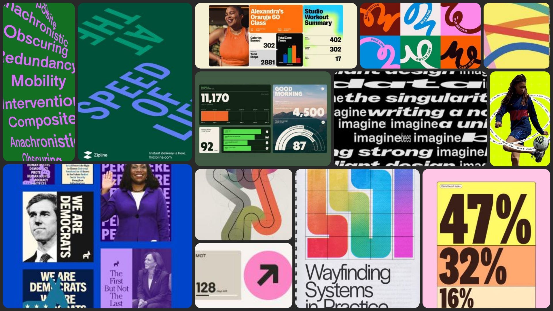
The first identity system we presented was something we called Modern Civic Optimism. We rooted it in this idea of mid-century “city of the future” aesthetics: structured grid systems, great sans-serif typography, bright colors, and this overall feeling of organization and progress. Think of the New York City subway style guide and other civic projects that feel utilitarian and clean, but still have a real point of view.
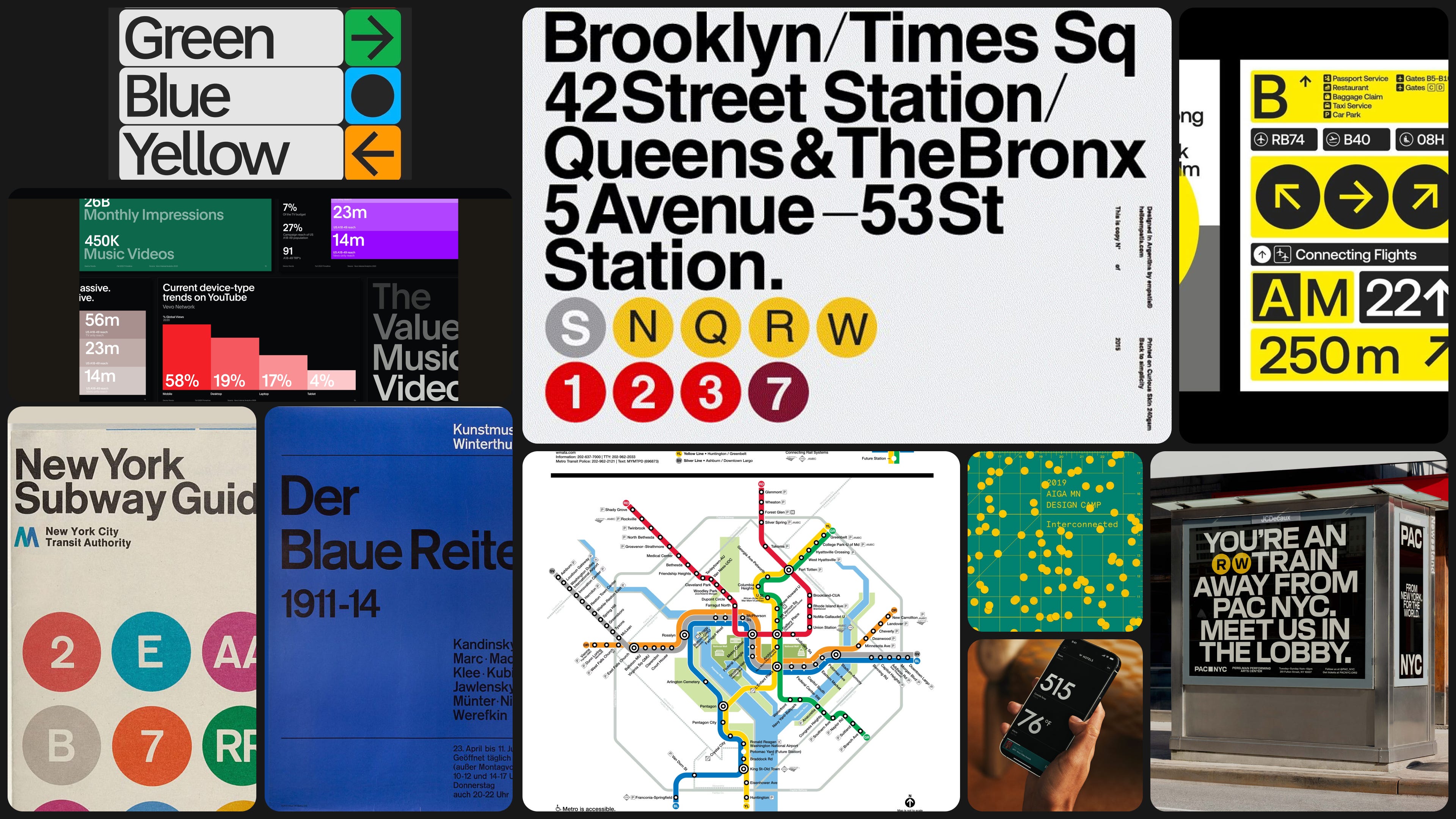
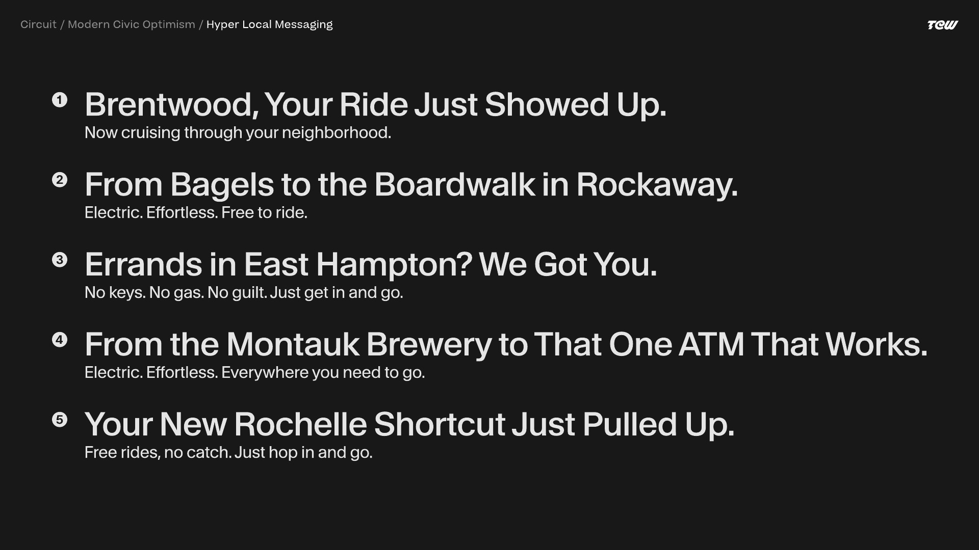
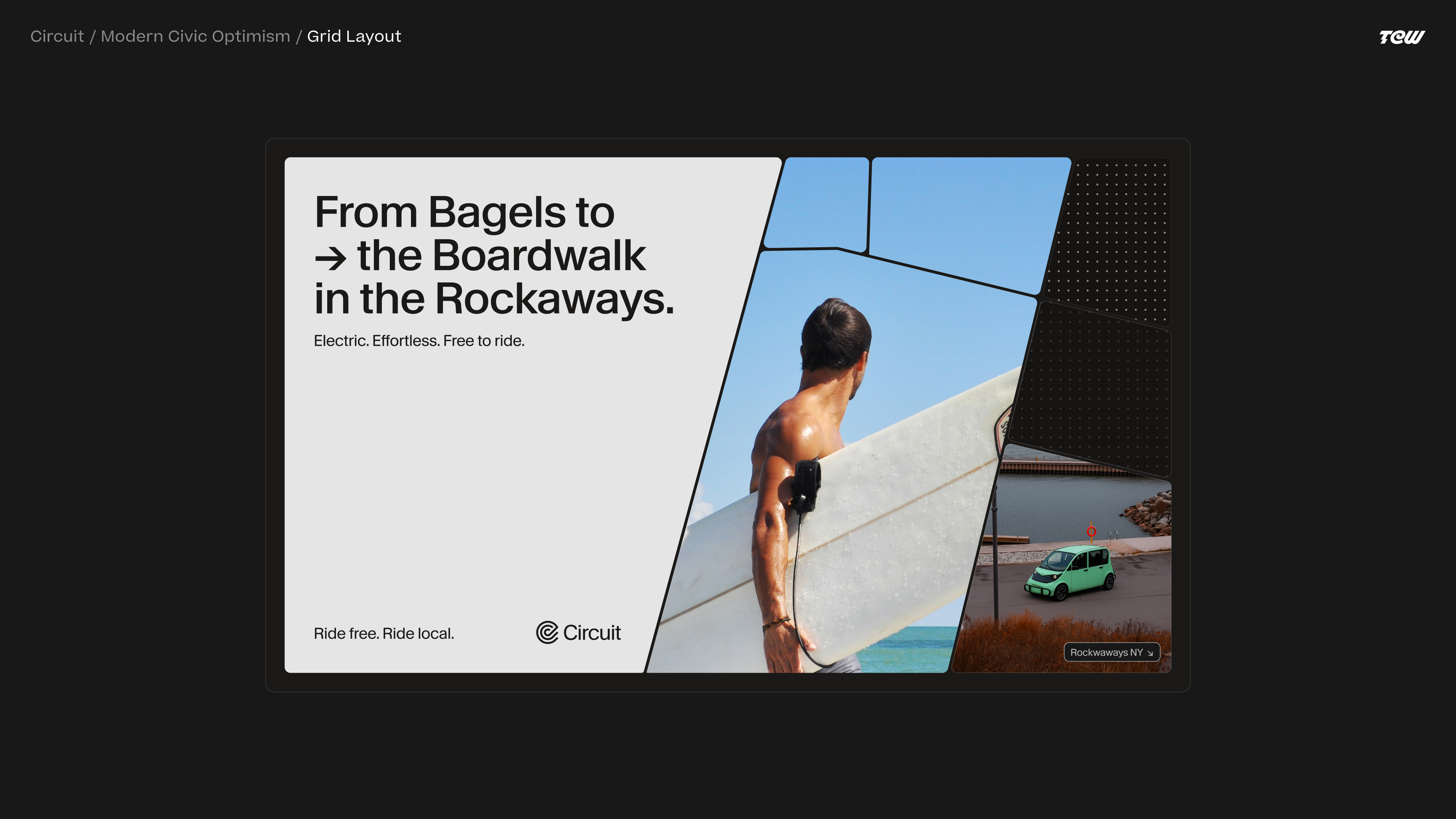
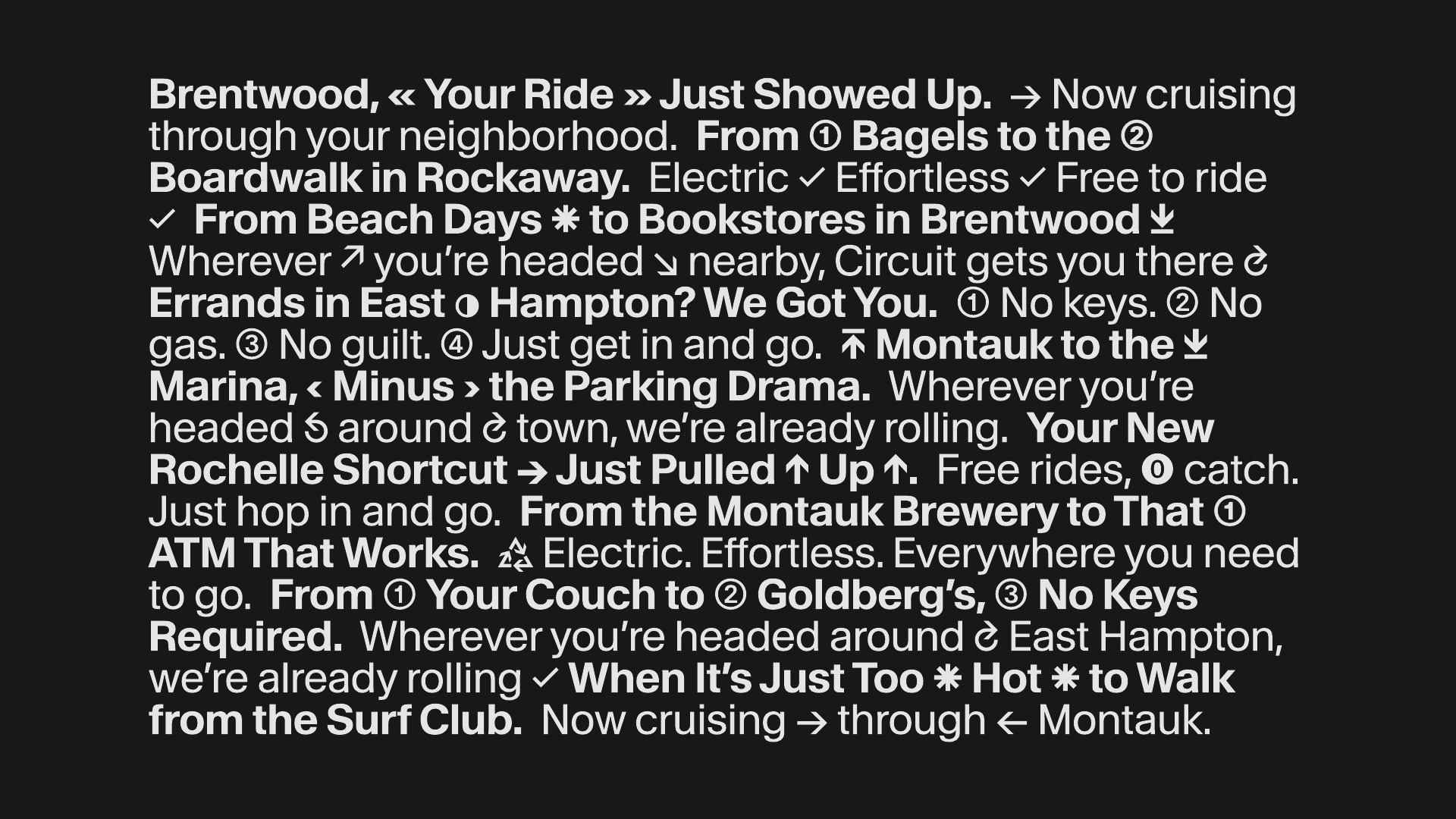
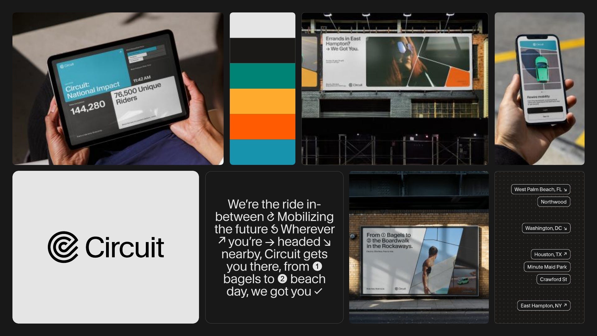
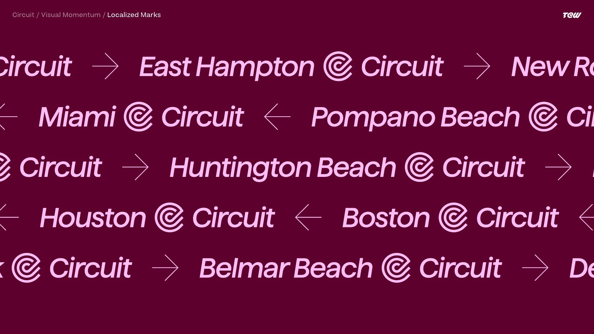
Of course, we didn’t want to only rely on Swiss typography and classic grid structures, so we had a few other ideas that made the direction more specific to Circuit. One was super local messaging. We wanted to use real neighborhood names, landmarks, restaurants, streets, and references that the local population would understand. The larger system could stay consistent while the language made it feel like it was speaking directly to the community.
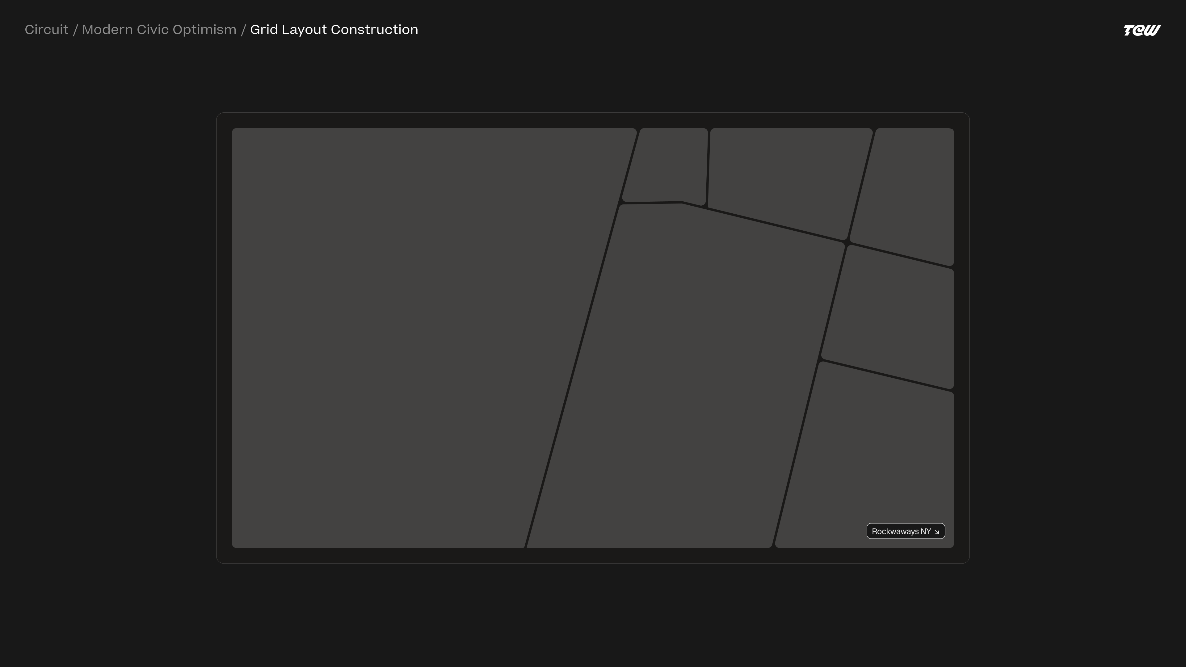
The other idea, which I still really like, was looking at local maps and street grids as the visual foundation for the identity system. Normally, when you’re designing an identity system, you establish some sort of underlying grid to organize content. In this case, we thought it would be interesting to let the city itself determine that grid.
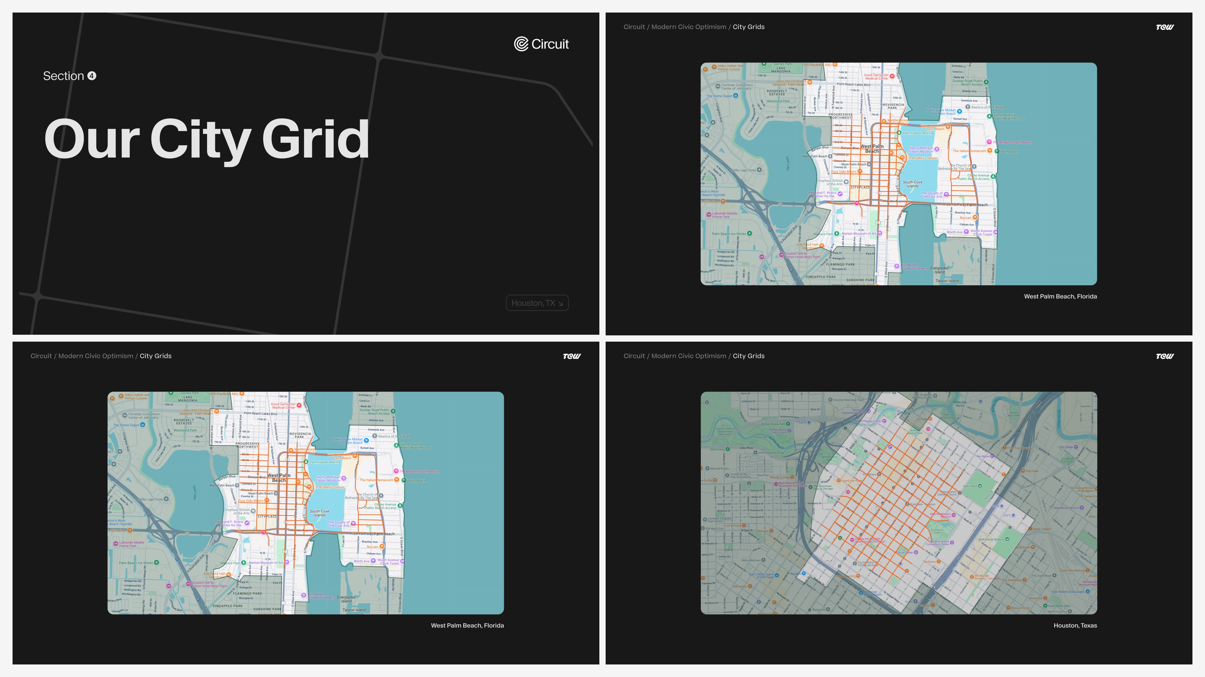
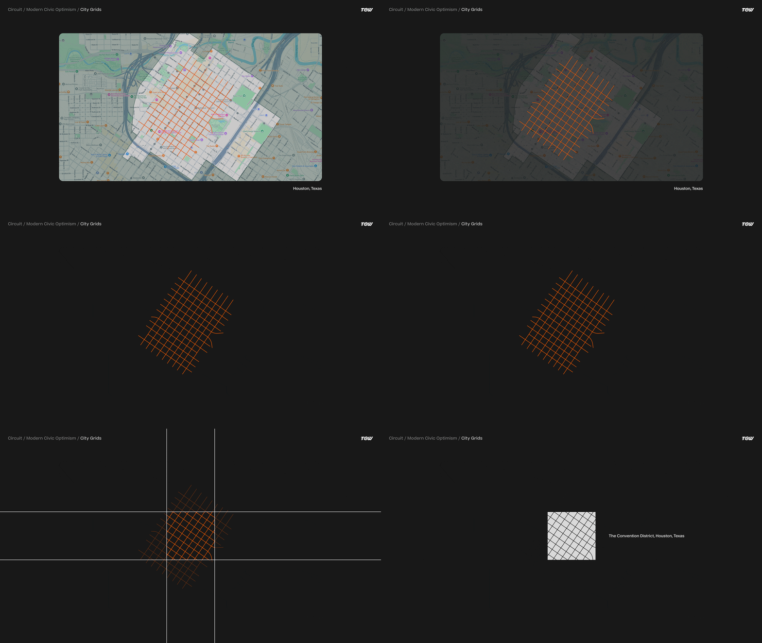
So if we were designing out-of-home, brochures, presentations, or other assets for West Palm Beach, Florida, we could look at the local system of streets and roads and use that as the grid on which the content was presented. If we were working on Houston, we’d do the same thing using Houston’s streets.
What I still like about this is that every city naturally gives you something different. Houston has this very clean grid system, while somewhere like Long Beach or West Palm Beach is much less organized and deliberate. The same basic design rule starts producing different results based entirely on the place where Circuit is operating.
At the center of the direction was also a really nice typographic approach. We had a great sans-serif typeface with a lot of glyphs that could be used to break up content, bring in some personality and motion, and still feel utilitarian.
We really liked the consistency of classic transportation systems and wanted Circuit to have some of that same feeling of trusted urban infrastructure.
Visual Momentum
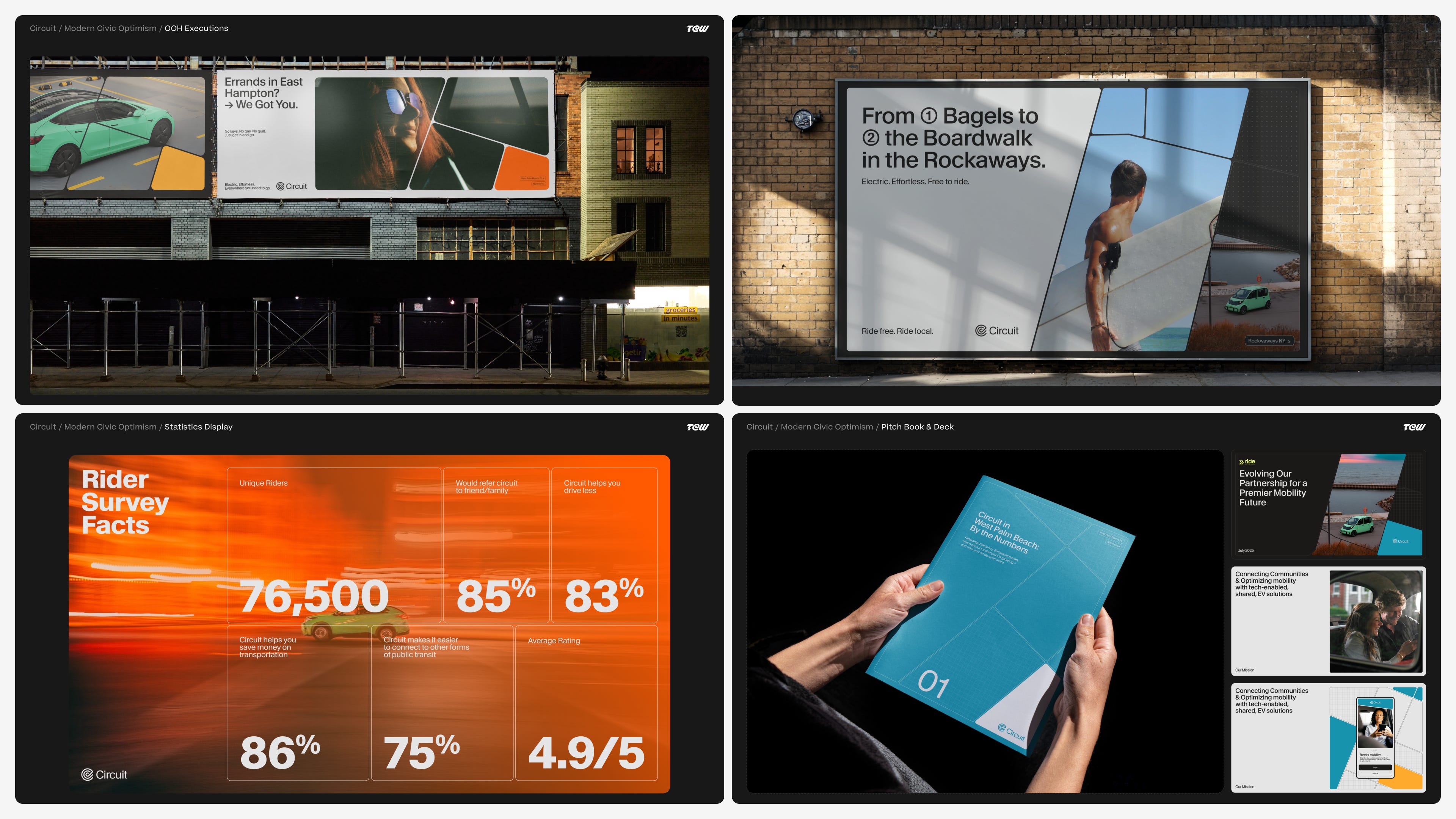
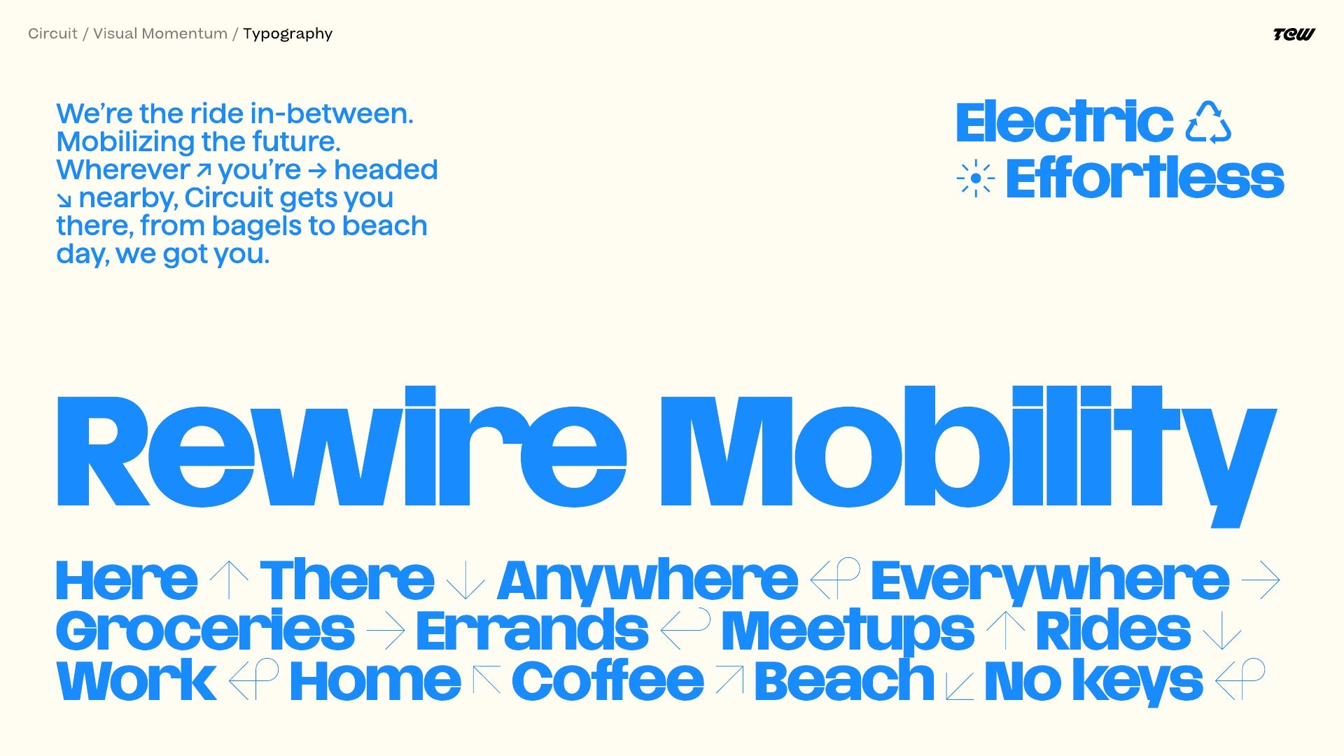
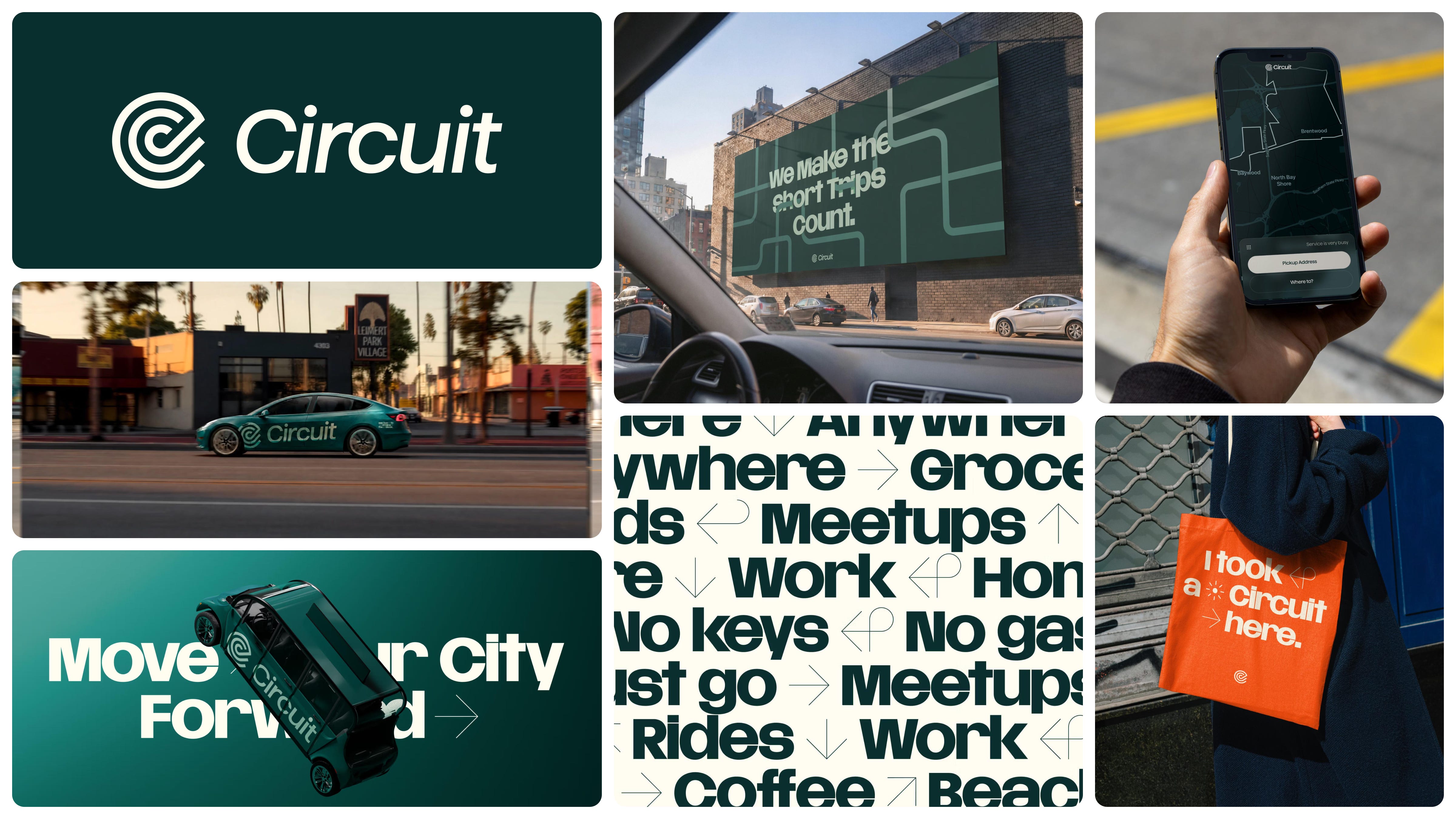
The second identity direction we presented was called Visual Momentum, and this is ultimately the direction Circuit selected. The idea here was to capture the energy of cities in motion, if you will, and position Circuit as an active, visible, essential layer of the city. We wanted type that shifted, moved, snapped into place, and layered into photography, motion assets, video, and everything else.
We pitched it as:
Circuit isn’t a separate service layered on top; it’s woven into the everyday rhythm of the city.
We wanted Circuit to feel deeply woven into daily routines and reflect how people are actually moving throughout the city. We also wanted to bring a sense of motion to every part of the brand. Animated or static, the identity should feel like it’s always moving. Bright colors, strong type, arrows, lines, and graphic elements made the system quick to catch and easy to recognize when you’re walking around or seeing one of the vehicles go by.
This direction leaned pretty hard on typography. This wasn’t just because we love typographic identities over here, which we do, but because it also made the system much easier to execute. Circuit’s own design team needed to be able to make things for a lot of different markets without us being involved every time. By establishing a toolkit of type, color, image masks, and a few other recognizable elements, we were essentially designing ourselves out of the process in a good way. We wanted the system to be robust enough that their team could actually use it without us around.
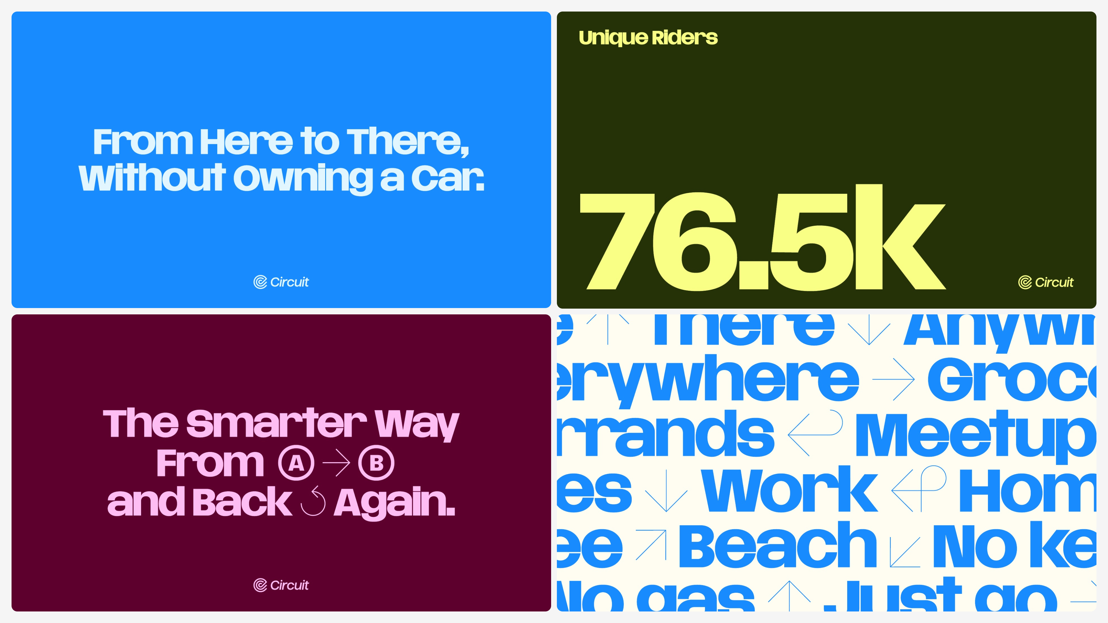
We created a lockup system for all the different areas and Circuit services that could sit next to the Circuit wordmark. We also really liked the conceptual core of the existing Circuit icon. It’s kind of a C, kind of a grid system, kind of a path, and it already had a nice sense of motion to it. Instead of throwing everything away because we were doing a new identity, we cleaned it up and sharpened it. Sometimes the right design decision is deciding what doesn’t need to be redesigned.
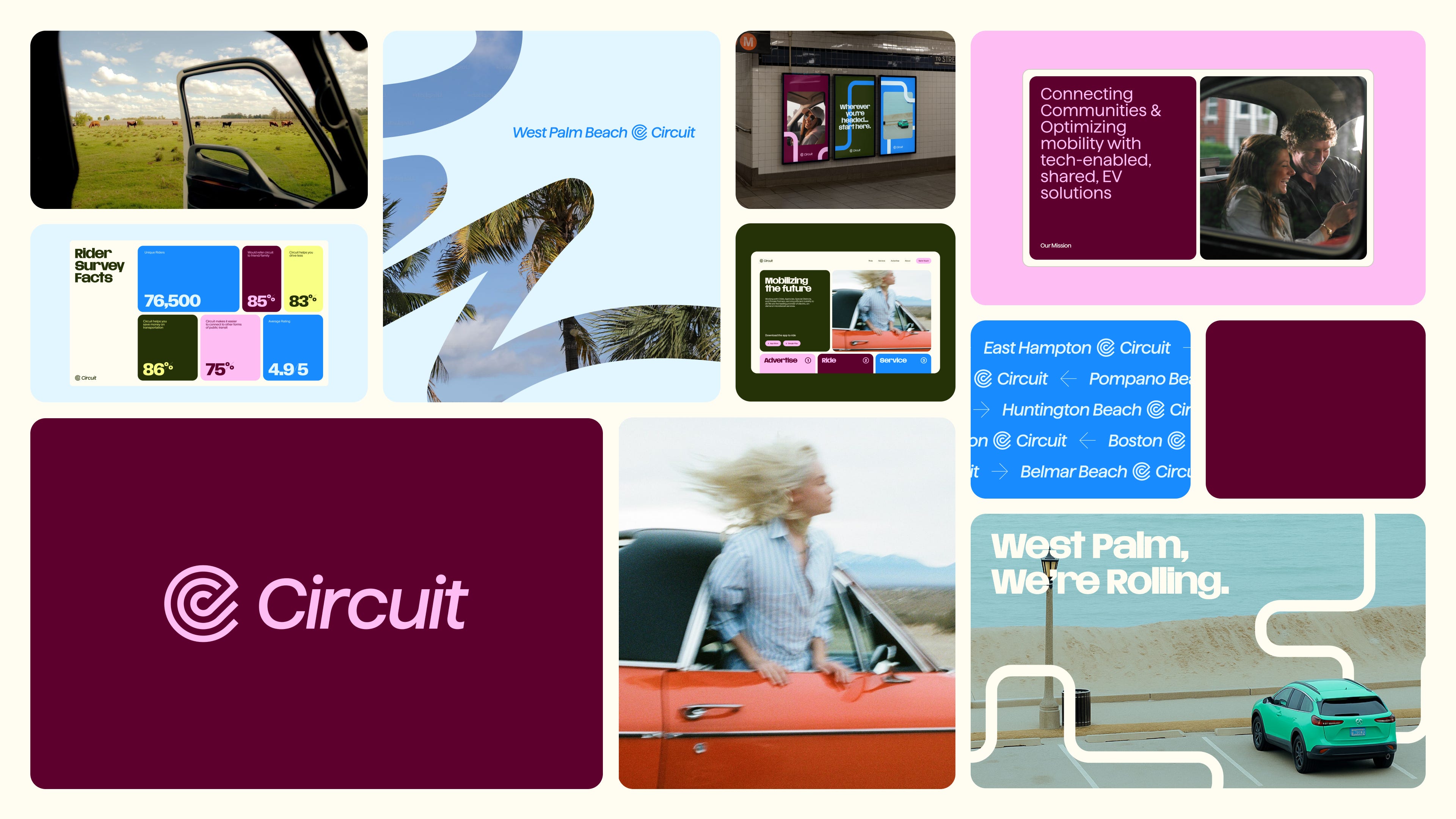
Where type and color weren’t quite enough, we introduced a few other elements. We created a masking system using the silhouettes of common road signs to crop imagery and video. We also developed this fluid traveling line that could move through compositions, referencing the path you take through a city, local road systems, and, of course, the idea of a circuit. It could travel across photography, knock through to video, or just bring another layer of movement into the system.
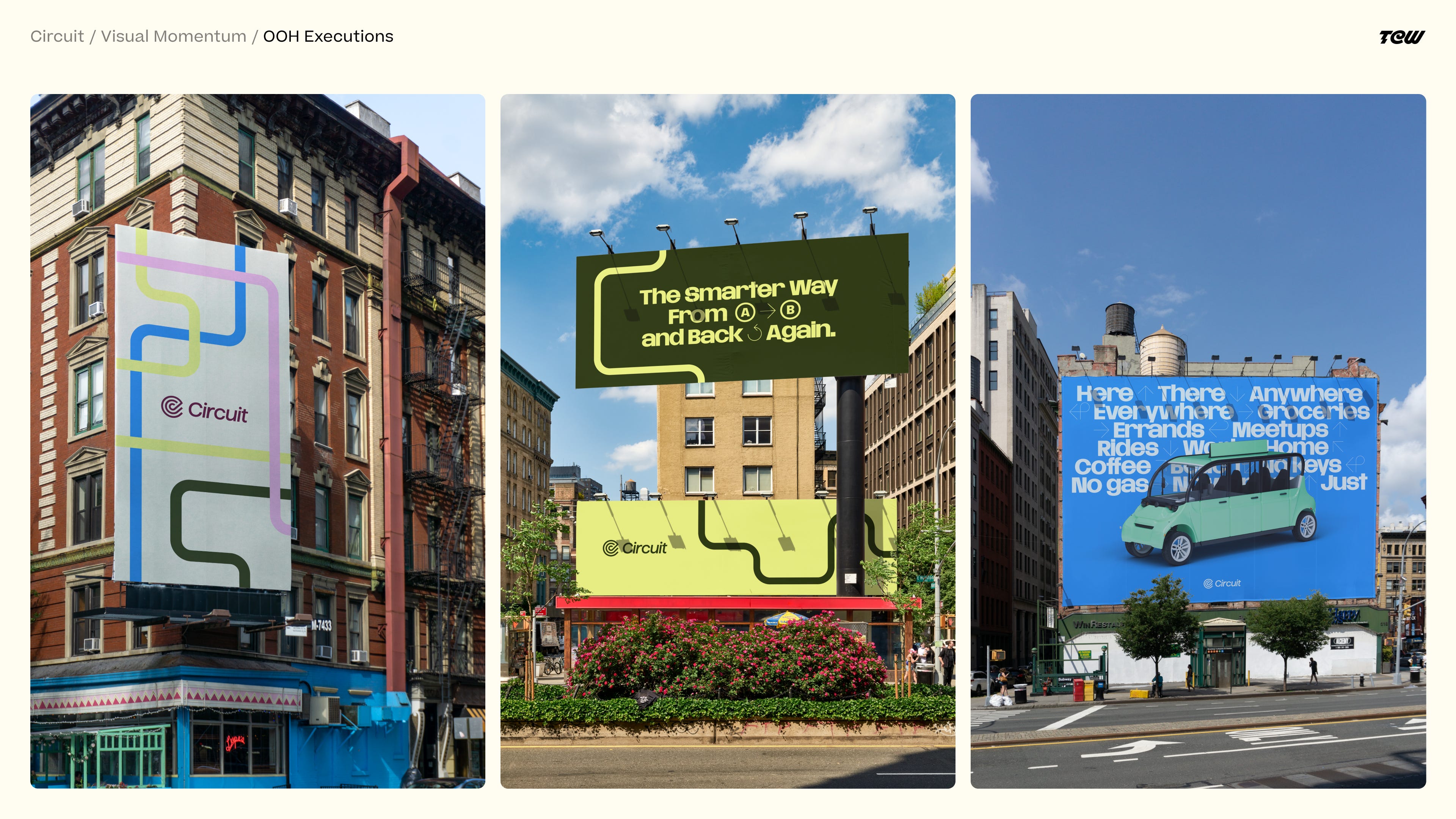
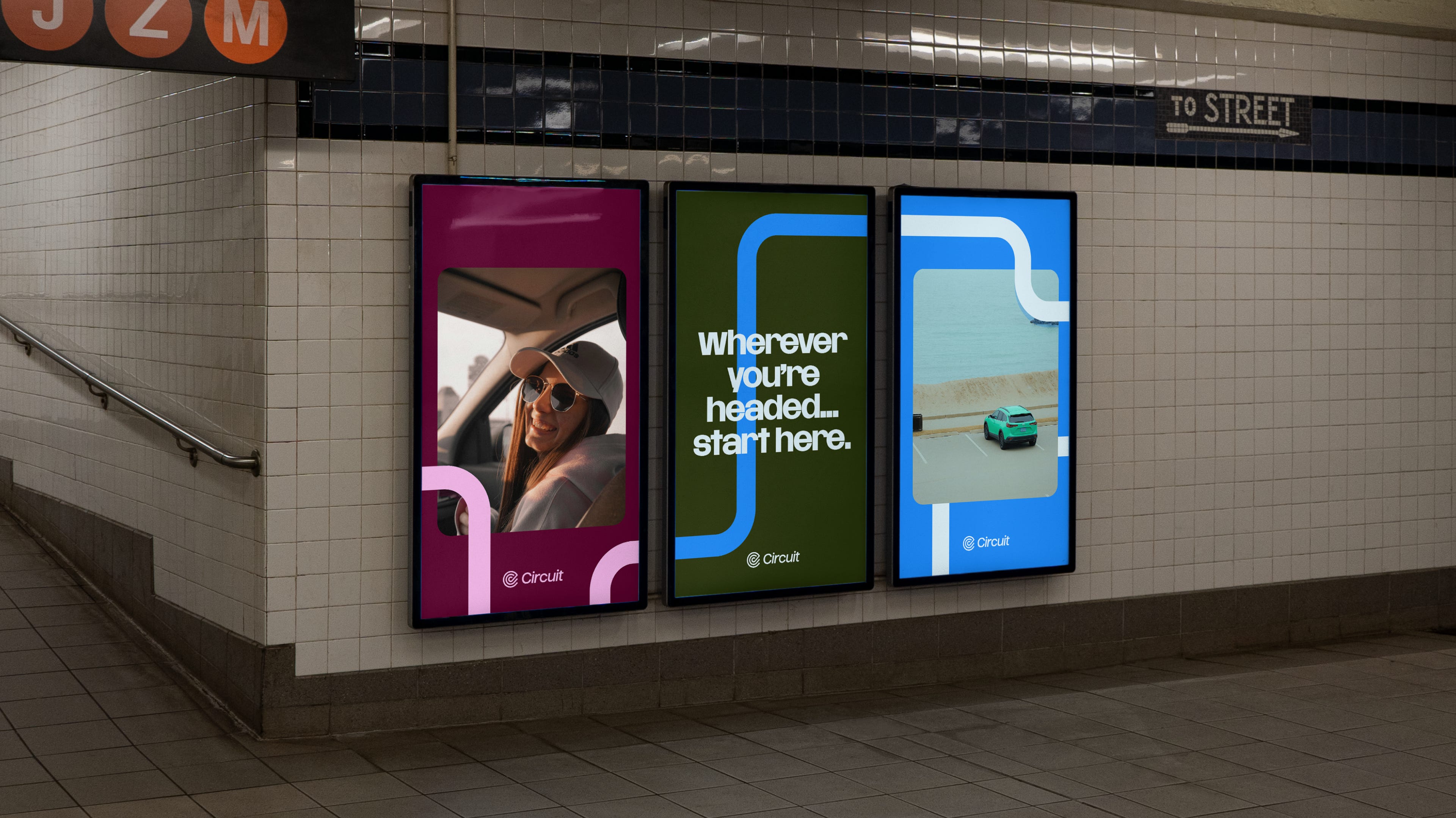
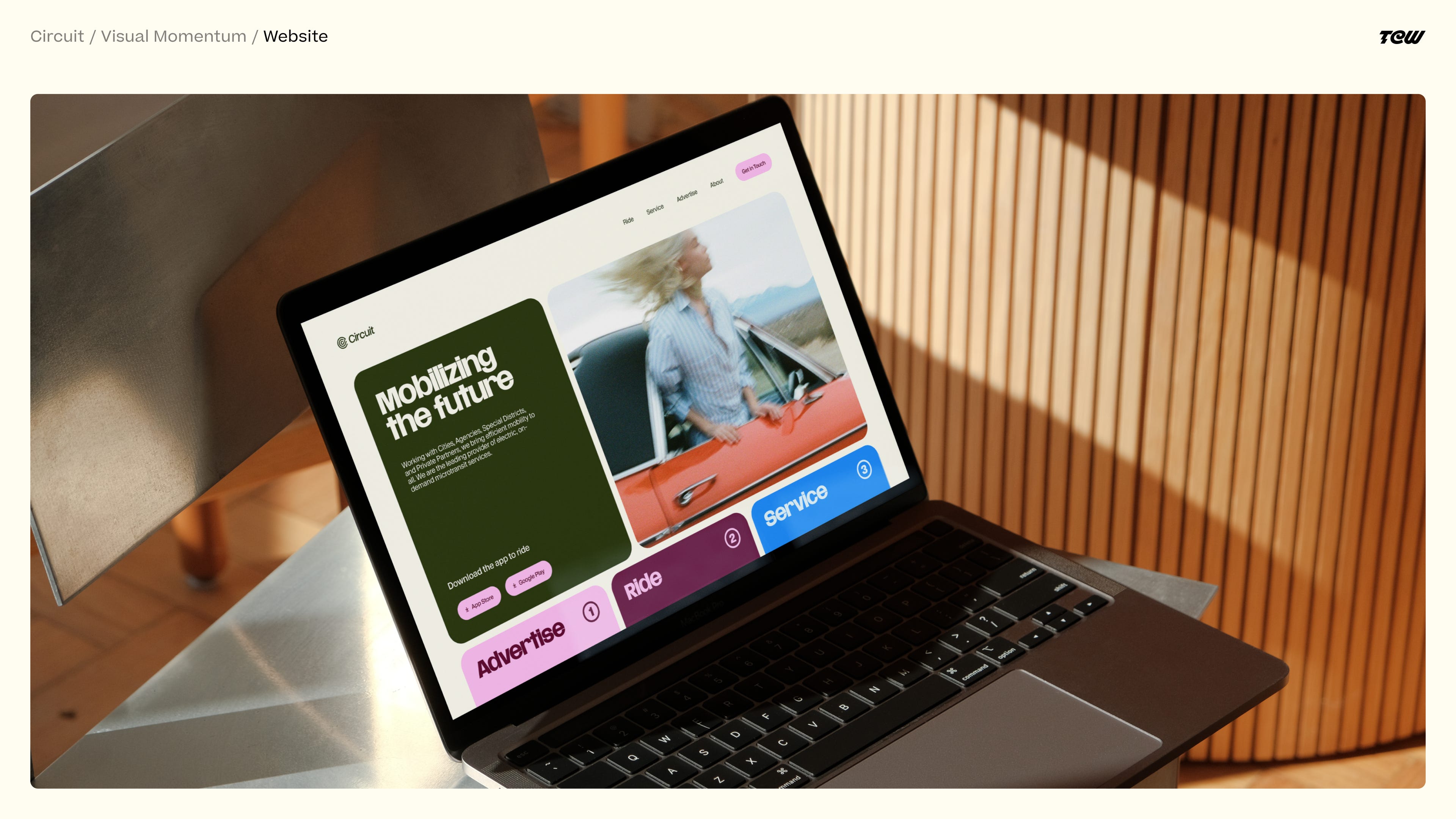
Once Circuit selected this direction, we focused our attention on really polishing the system. We kept the hyper-local messaging because we loved the idea of speaking to different communities through references, locations, and neighborhoods that people there actually recognize.
The Cars
The cars were probably the brand’s most important piece of media. They’re driving around these communities all day, and sometimes you’re going to see one parked three feet away from you while other times it’s going to pass you at 30 miles an hour.
We wanted the wraps to feel recognizable without being exhausting to look at. The green is relatively subtle, which we liked, while the wordmark is quite large. If the car drives past you, it should still be very clearly a Circuit vehicle. We didn’t want to cover every inch of it in graphics just because we could. These are vehicles people might see every day for years, and we didn’t want them to feel tired or exhausting.
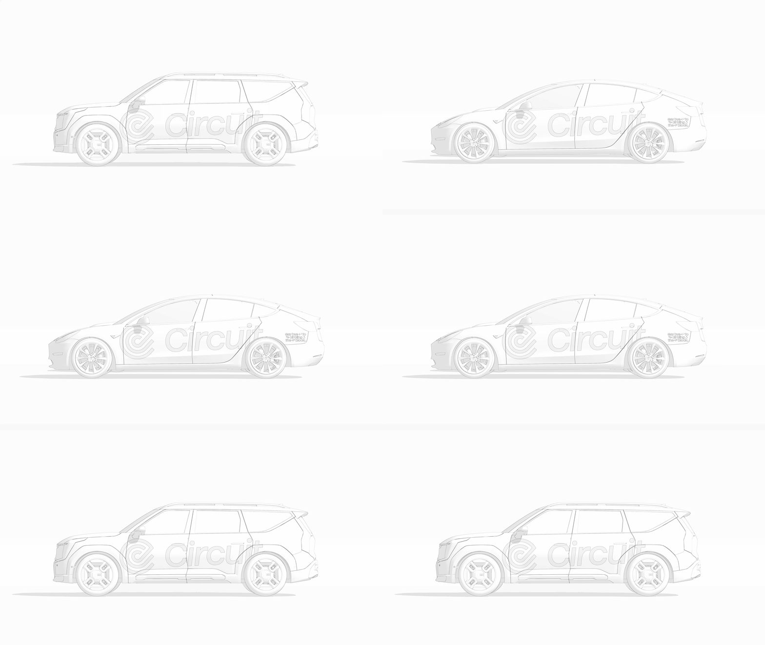
A lot of our initial ideas for the vehicles were quick renders and sketches, so once the direction was selected, we went in and created much higher-fidelity versions. The timing of actually wrapping all of the Circuit vehicles was going to be long. Across the fleet, some of these updates could take months or years to physically roll out.
Being able to create realistic renders on our end was useful for more than just showing how dope the cars would eventually look. Circuit could immediately use those images in presentations for local governments, communities, and other decision makers in places where they wanted to start offering service.
One of my favorite things about the final system is how much it borrows from things people already associate with transportation: road signs, directional shapes, maps, lines, grids, and movement. Referencing that existing visual language connected back to this idea of Circuit feeling trusted and utilitarian, rather than like a startup that could be here today and gone tomorrow.
I think there’s sometimes an assumption in identity design that the most interesting answer is to invent something completely new. For Circuit, that didn’t feel like the right answer. Taking a road sign silhouette and turning it into an image frame, or taking the idea of a route and turning it into a graphic line moving through a composition, felt like a more sophisticated and useful way to approach the problem.
What We Took Away From It
This project taught us a lot about really understanding the audience and the message that needs to be delivered. It would have been very easy for us to assume our audience was just the people using Circuit. After all, that’s the immediate answer. But once we started working with the Circuit team and understanding the complexity of the landscape, we realized we really needed to approach the decision makers in local government as the first audience. That changed how we thought about the project and ultimately made the work stronger.
We’re also increasingly less interested in creating something different just because we can. I think sometimes studios approach traditional industries with the mentality that the answer is to shake everything up, and sometimes it feels like the goal is winning awards as opposed to truly solving the design problem.
The longer we do this, the more we’re interested in pushing ideas to be better, more sophisticated, more approachable, and easier to understand without breaking the foundation of the idea that made something useful in the first place. Trust and consistency were so important for Circuit that those things needed to stay in the final result. We kept the core of an icon that was already working. We borrowed from a transportation language people already understand. We made the cars recognizable without covering them in unnecessary graphics. And we built a system their team could actually use without us.
I really like where we landed for Circuit because, to us, it feels exciting, interesting, and sophisticated, but it also feels rooted in the strategy work that we developed at the beginning of the project.
Hopefully everyone gets a chance to interact with Circuit at some point, sees one driving around their local streets, and can jump in for a low-cost or free ride in their community.

